Reflecting on previous exercises through the course:
I particularly enjoyed the landscape and outdoor drawing (part 3) probably because the nice weather allowed me to sit outside and I looked at and emulated a variety of artists.
I discovered Oriental drawing and have found much of the work I like is emanating from the hand of artists of modern Oriental origin such as Ryoko Aoki ref:and Nobuya Hoki ref: https://bemilne.wordpress.com/category/coursework/part-three-drawing-outdoors/ both of whom use delicate line in their production of images. I have discovered this again in the work of Friedrich Kunath in the new Vitamin D2 New Perspectives in drawing book.
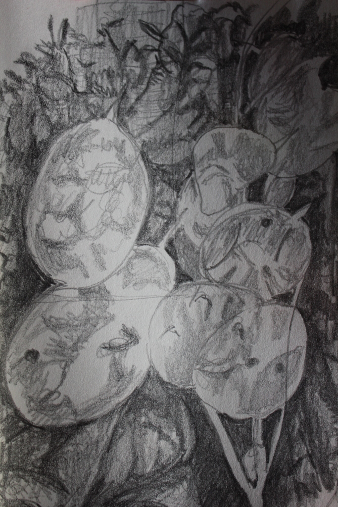
I produced a few successful drawings in monochrome ink using Ugo Ronidone and Van Gogh as inspiration. These I liked for two different reasons, the Ugo Ronidone image because of the care and time put into the drawing of a simple bush of leaves. This image has good contrasts between fore and background and good negative space. It feels both fussy and calm and accomplished ref: https://bemilne.wordpress.com/category/coursework/part-three-drawing-outdoors/ I like my emulation of the Van Gogh image (in “plotting space through composition” section) ref:https://bemilne.wordpress.com/category/coursework/part-three-drawing-outdoors/ ) because of the variety of marks which serve to separate background from foreground and produce confusion. Ryoko Aoki’s influence appears again in “plotting space” as I convert the view across the field, through the fence to a simple felt tip image. This is jolly but benign and somehow grates on my eyes, perhaps there is just too much going on. (ref:https://bemilne.wordpress.com/category/coursework/part-three-drawing-outdoors/)
I also loved drawing sitting in the grass in the orchard and in the meadow, both images full of fuss and colour , with Ugo Ronidone in mind in the orchard drawing and the meadow without influence, but an experimentation in mark making. I am unsure if I agree with my tutor that the sky is unfinished-I think it is in keeping with the dotty/dashy feel of the drawing. (ref:https://bemilne.wordpress.com/category/coursework/part-three-drawing-outdoors/project-drawing-trees/)
Townscapes were less successful. I am unhappy with people around, feeling I need to draw more quickly. Also, the duller colours and less interesting forms compared to nature are less inspiring. Lowry is good but I have never been completely inspired by his dull grim images, liking them only because of their relative humour and their depiction of home in the North West.
Although I’d love to draw outside in the winter -I find it difficult to sit in the cold and the potential of rain washing me away. Do I take photos and then draw from them? I am not keen on that
Hence, I have decided to concentrate on Part Two Observation in Nature and see what I can do with simple winter plants, particularly seed pods and crumpled leaves.
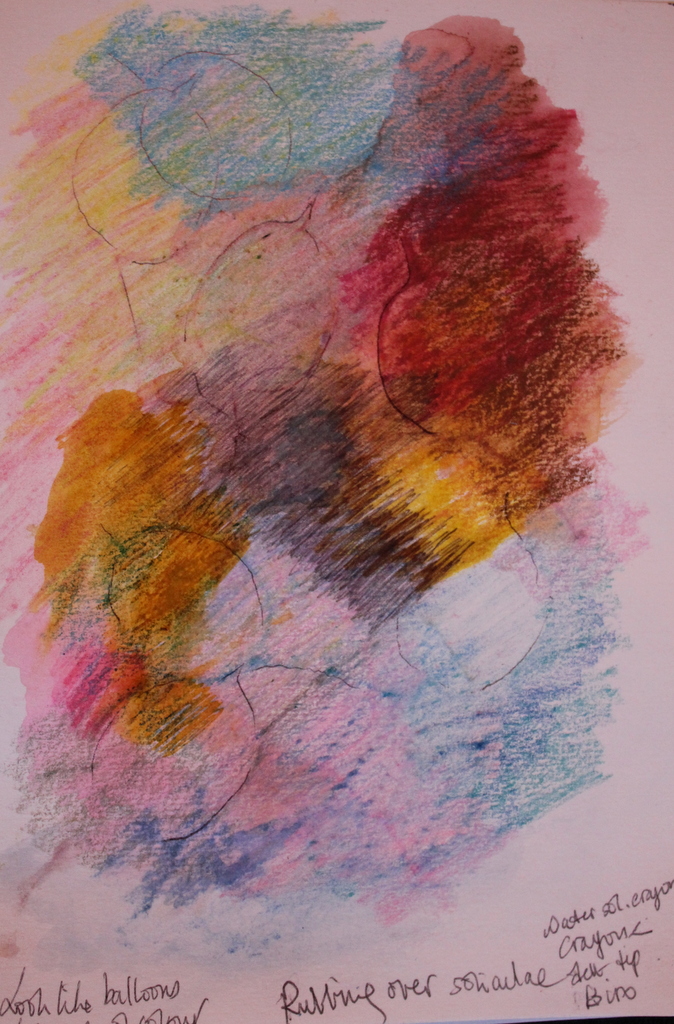
This was not a very successful project at the time I first attemtped it, mainly I think, because I had no books or advise on artists to research, to guide my drawings. However I enjoyed using dots and stipples and find they produce a light-hearted atmosphere. (But I am constantly reminding myself of the many other marks that help depict an image. I liked the drawing ( with Passmore in mind) of the vegetables on the table –swirling lines producing a landscape as much as a kitchen scene. (ref: https://bemilne.wordpress.com/category/coursework/part-two-observation-in-nature/page/2/)
I did not like drawing animals. They move too much and they have little colour compared to fruit and flowers . Also, depicting character through image is certainly not (as yet) a forte but it is something I need to work on.
This was equally so with section 4, “drawing the figure” I like the curves of the figure and perhaps should have attacked the images with more colour and varying marks to produce greater inspiration. I enjoy sketching little thumbnails of people whilst sitting in cafes or stations but I can’t see these ever developing into larger pictures except as part of colour based socially descriptive “scapes” of my local surroundings. Capturing thoughts and character, I feel are something on which I should work.
What I did like about figure drawing, were the folds of fabric and the colours of clothing. I discovered Toulouse Lautrec who uses clothing as part of the overall social image and Leon Bakst whose costume designs for the Russian ballet had some of the feel of the natural worlds colour and shapes (in the twisting positions of the figures) . ref: https://bemilne.wordpress.com/category/research-and-reflection/artists-researched-on-web-or-books/leon-bakst-artists-researched-on-web-or-books/
Self portraits gave greater option to look at other artists in a more private environment and so develop ideas a little more, but I was still not as enthused as much as by nature, partly because the image is so “enclosed” an entity and it is so difficult to get a likeness as the human brain is so atuned to the minor nuances of the figure and face. This is an area I do need to practice.
Therefore my aim for project five is to study the plants of winter
The most successful and enjoyable images produced from “part two Observation in Nature” were those of the fruit and vegetables hatched in colour. I am very fond of colour and particularly strong colours-but here I used the subtle pencil crayons or felt tip to depict bananas and apples in unusual relation to each other and to the paper
ref : https://bemilne.wordpress.com/category/coursework/part-two-observation-in-nature/page/2/
Although I feel I am not “good” at composition, I have always been fond of the ASKEW, the IRREGULAR in composition .
I would like to venture into the final assignment from the aspect of nature, to research more artists in this area and to use the dry and discoloured plants of winter.
—————————————————————————————————————————————————————–
ASSIGNMENT FIVE
USE CLOSE OBSERVATION / REFLECT ON WHAT ATTRACTS YOU/EXPLORE CHARACTERISTICS AND STRUCTURES OF NATURAL FORMS////USE TECHNIQUES TO EXPRESS WHAT YOU SEE//experiment with a variety of media//
======================================================================================
So, Thinking about the subject for the final assignment
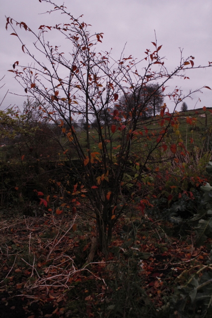
During an early morning walk, I took some pictures, the sun had a pinkish wintry hue, the red winter trees were glowing in this light.trying to capture( by manual control of the camera settings), the colours, the soft warmness and the silence of this morning, but it was too dark to see with a camera what the eye could see.
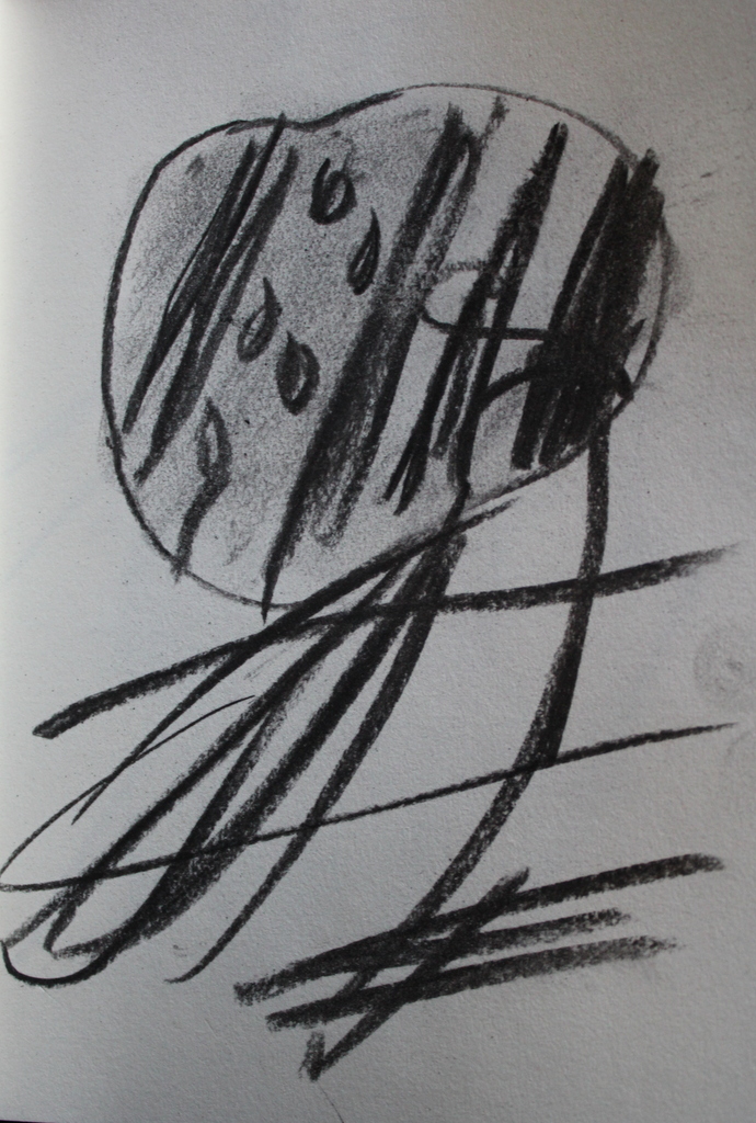
 Of note the light histogram of the photo showed graphical grouping at the very light and the very dark polar ends of the spectrum. I know I often draw this deep contrast in tones e.g black against bright colour and am obviously attracted to contrasts.
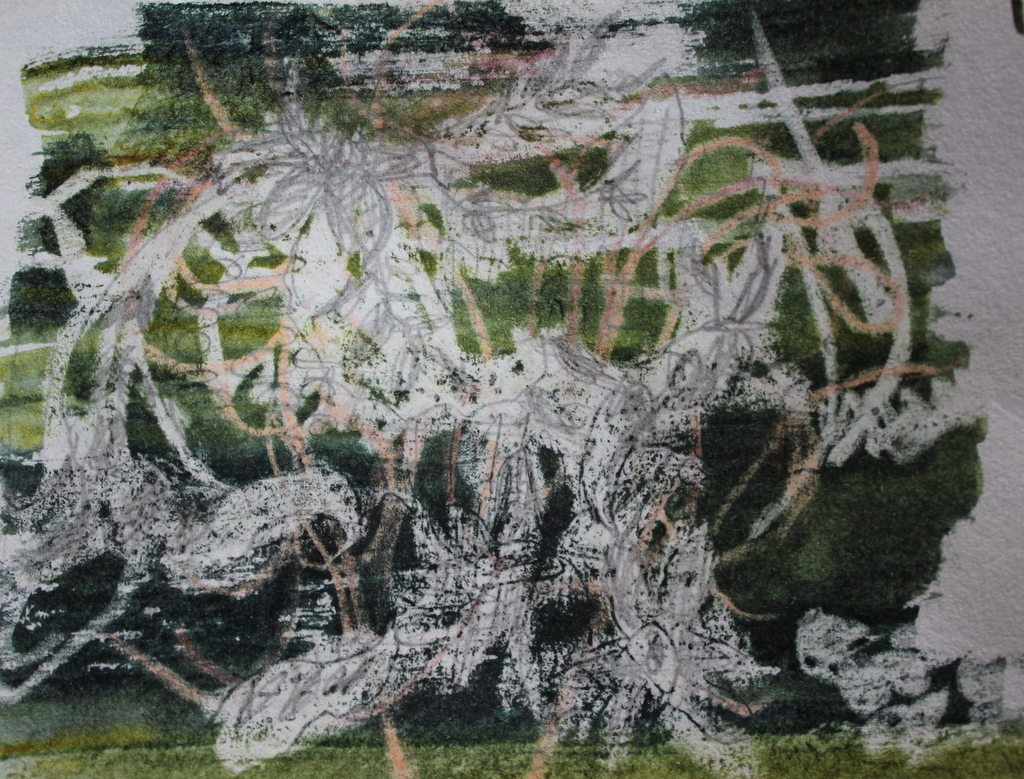
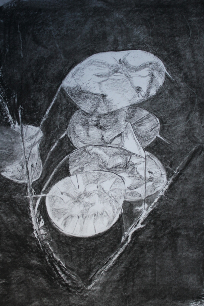
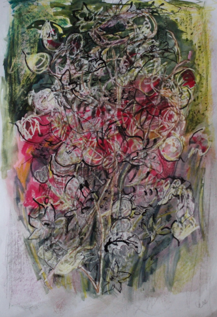
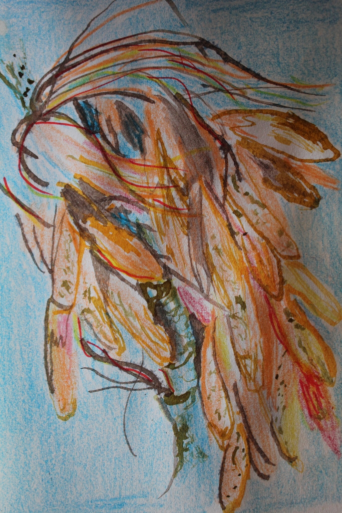
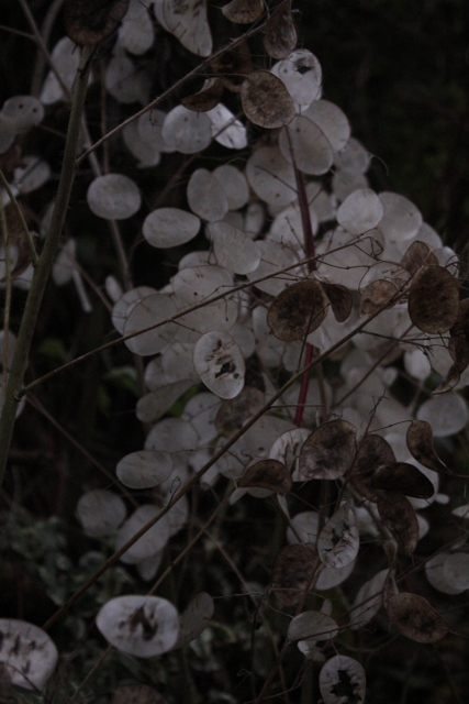
What struck me most that in this pink glow were the seed pods of the Honesty flower (the siliculae) .They were shinning silvery white, nestling under the trees .I have used these plants before for two winter pictures, one in collage and one in oil. I seem to have a fascination for their frailty, their shiny white ,silver grey irregular colour, their crispiness , their beautiful flat and rounded shapes and the manner in which they are collected in crowded irreguklar groups on the stems.


Could I reproduce the colours of this morning and the peaceful warm feel?
The honesty seeds remind me of the delicacy of lace and the soft shininess of silk or velvet.
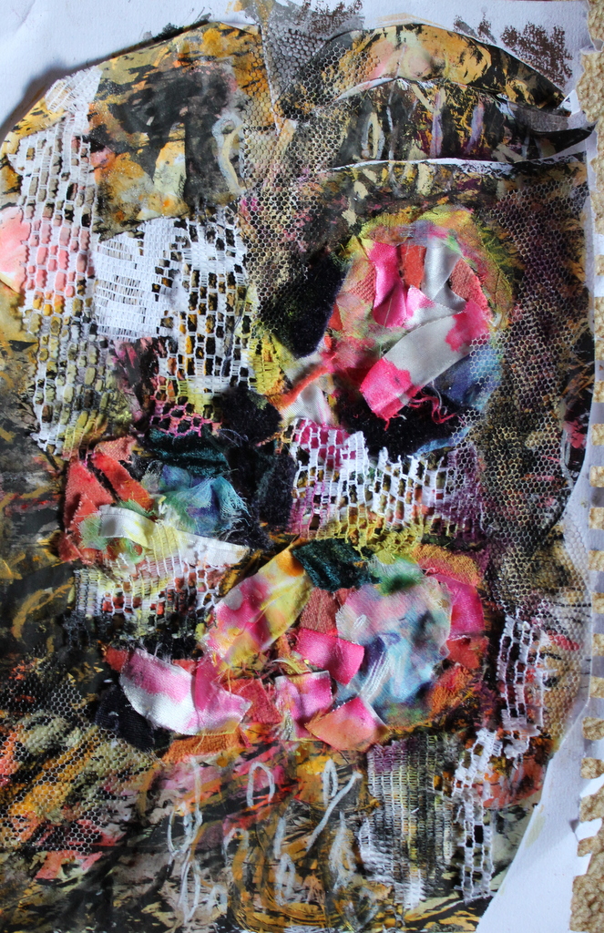
I have decided that because of my love of lace and delicate patterns I should look at lace to help with the final drawing of these honesty seeds.
New Life in a pod
I also remember that one of my pictures of the seed pods in the past highlighted the presence of two seeds beneath the silvery tissue membrane of the pod and reminded me of foetal twins nestled in the uterus protected from the outside and wondered if I could bring in the medical world to the final drawing or at least a feeling of the development of new life.
What is the best way to depict something so delicate as portrayed by the frailty of the seed pod and by the implication of new life emerging from the dark and relatively lifeless protection of the womb? Perhaps the seeds are delicate and the pod stronger in its protection than it appears.
How could I depict these life protecting pods?
Looking at modern artists as depicted in the books :” Vitamin D New perspectives in Drawing” and “Drawing Now Between the lines of contemporary art” I return to the Japanese artists Ryoko Aoki (Ref: http://uk.images.search.yahoo.com/search/images?_adv_prop=image&fr=mcafee&va=Ryoko+Aoki+drawings )
and( a more recent finding of),Nanako Kawaguchi (ref:http://www.jerwoodvisualarts.org/nanako)
the gentle colours and delicate sketches of Michael Landy’s drawings (ref: http://www.tate.org.uk/art/artworks/landy-common-groundsel-2-p78733)
What media would satisfy the feel of silence, delicacy —fine, hard pencil, fine pen and ink, coloured pencils -perhaps some chalks or conte? What colour the paper? White or tinted pink–too twee? Could I incorporate the use of silver on pen?
How could I produce a feeling of life protected -with a hint into human life?Or does this route seem too descriptive.
What about the background of leaves being made up of images of hands of children like the prehistoric drawings? would that be too “tacky”?
Perhaps I should stay in the realm of delicate pattern and colour.
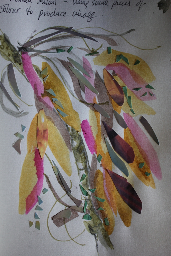
I have also recently been to Germany and visited lots of art galleries . One individual (Jiri Kolar) fascinated me by his obsessiveness. He cut up paper into small pieces and put them back together in images …this could be a way of representing lace? ref: https://bemilne.wordpress.com/2013/12/15/jiri-kolar-artrist-in-collage/
Other artists I have recently found that I wish to emulate in one form or another in the final assignment:
Caroline Ali ref: http://www.rbsa.org.uk/members-associates/members/view/9/Caroline-Ali/
I love the way she has used small insects in multiple images to produce a delicate pattern which is more artistic than biological . Her images are very light and delicate with minimal delicate colouring. I note in some of her images she uses silver ink (which is an idea I had had in the drawing of the very silky seed pods) as well as light graphite, black ink and watercolour.
Georgia O’ Keefe (ref:http://en.wikipedia.org/wiki/File:Georgia_O%27Keeffe,_1915.jpg)
What I love about Georgia O’ Keefe’s images is the manner in which she focuses on an area of a plant to produce an abstraction but retaining an organic feel. I also admire her use of colours which compliment and enhance but do not describe detail, and of her flowing organic shapes


 Detail of a wall stencil from Hill House


 Patrick Caulfield Coal Fire 1969 sourced on line Feb 2014 from :


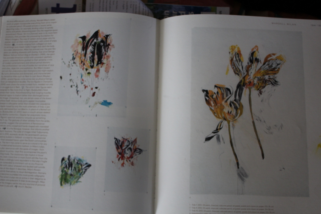


 textile design -stylised tulip pencil on brown tracing paper by Charles Rennie Mackintosh sourced on line Feb 2014 from:


